Featured Projects
Noodo
Positioning & Packaging
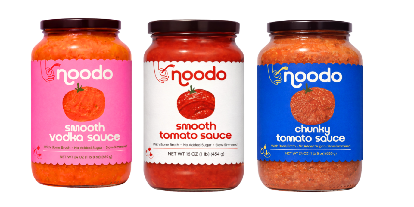
Some brands have a great product but haven't yet found their story. That was Noodo — a better-for-you tomato sauce made with bone broth, no added sugar, and slow-simmered care. The product was exceptional. The packaging and name weren't yet doing it justice.
Through our work together, we repositioned the brand around what made it genuinely different: real ingredients, Italian-inspired craft, and a personality that could stand out in a crowded sauce aisle. The result is a brand that stops you mid-shelf — bold color blocking, a playful identity, and labels that communicate quality and approachability in equal measure.
Noodo is now shelf-ready. And it looks the part!
BEFORE
AFTER
Samsara Nutrition
Packaging
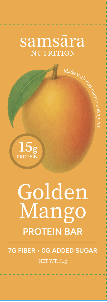
Samsara Nutrition came to me with packaging that wasn't yet working as hard as the product inside. I consulted on a full packaging overhaul — focusing on shelf presence, clear communication, and brand differentiation. We sharpened the front panel hierarchy so the most important information landed immediately, and ensured each SKU had a distinct identity while reading cohesively as a line. The result is packaging that stops the scroll, communicates clearly, and gives shoppers a reason to connect before they ever take a bite.
BEFORE
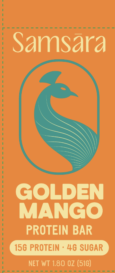
AFTER
Packaging
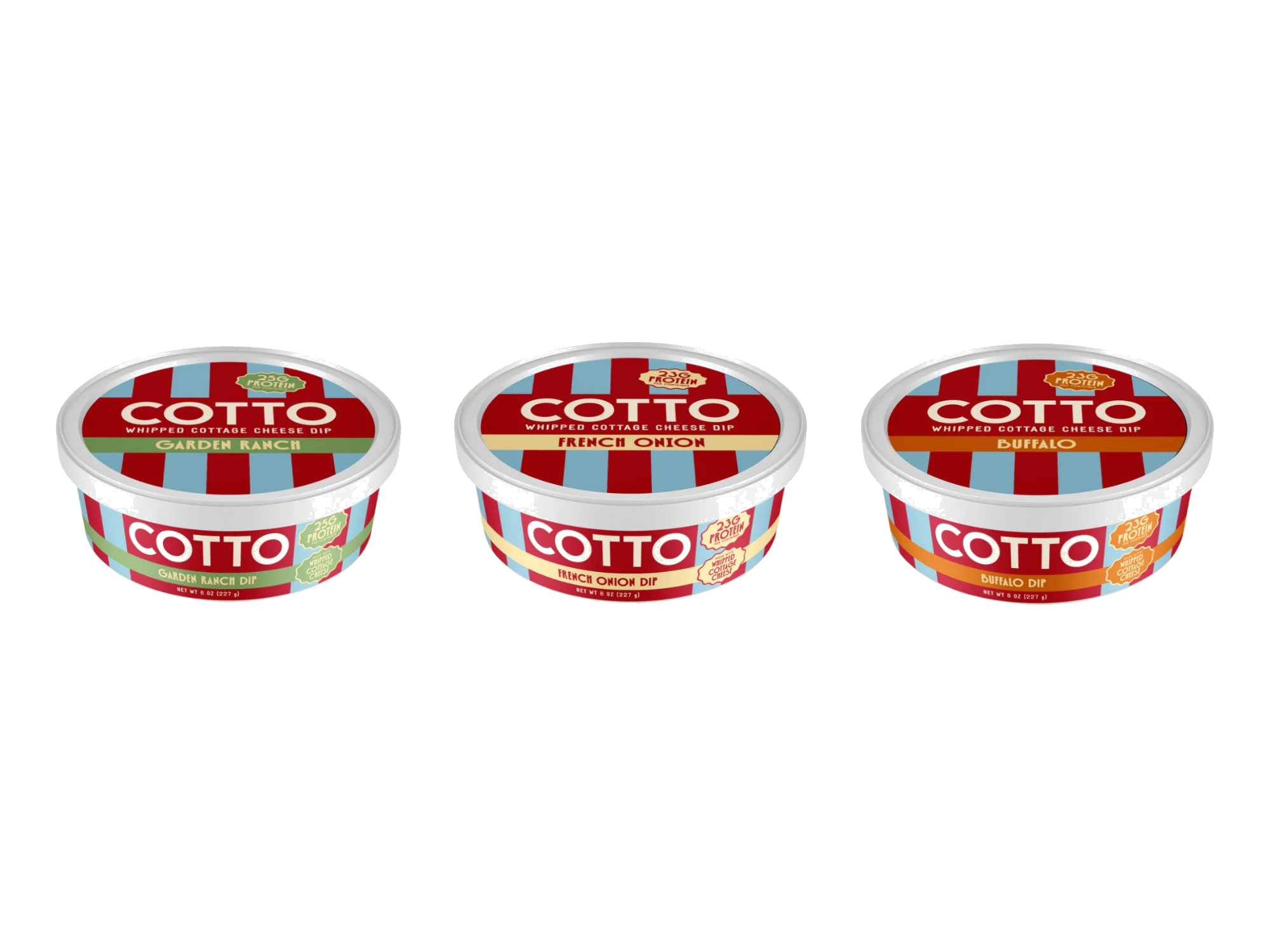
Cotto had the right product at the right time — a whipped cottage cheese dip riding the wave of the cottage cheese moment — but the packaging wasn't yet communicating what it was clearly enough. In a grab-and-go dip aisle, a shopper has seconds to understand what they're looking at. Those seconds matter.
The refinements focused on three things: making "whipped cottage cheese dip" unmissable on pack, improving font legibility so the brand and flavor read instantly from a distance, and tightening the overall visual hierarchy so nothing competed for attention.
The result is a package that's fun, bold, and instantly clear. Cotto is quickly picking up steam in retail — and shoppers know exactly what they're getting before they even pick it up.
Cotto